About this item
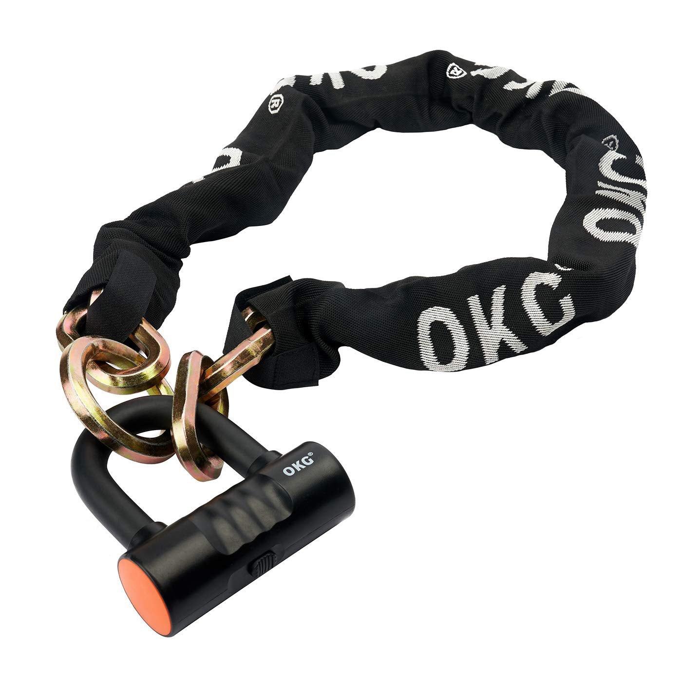
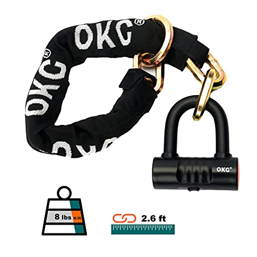
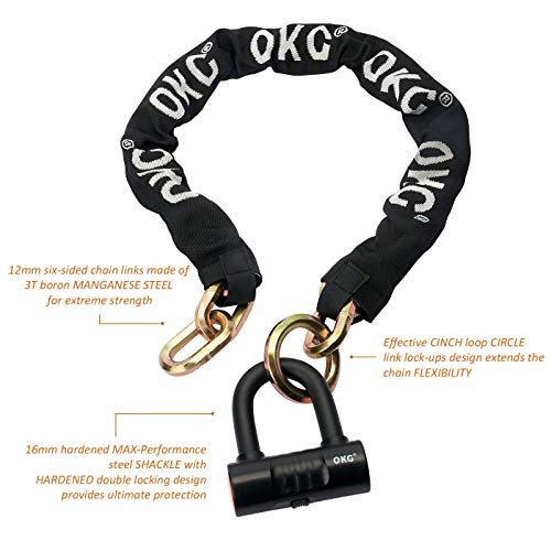
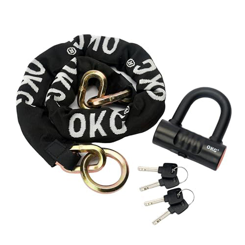
- 12mm hexagonal chain links made of advanced triple heat-treated boron MANGANESE ANTI-RUST STEEL for extreme strength. Narrower inner width of individual links prevents bolt cutters. bolt croppers and leverage attacks.
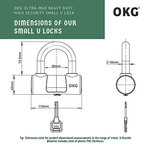
- Reinforced. anti-rust. shrouded lock shell and 16mm hardened MAX-Performance steel SHACKLE with HARDENED double locking mechanism provides ultimate protection against hand tools. bolt cutters. saw. leverage and bolt croppers attack. High security STAINLESS STEEL disc-style cylinder with anti-drill. anti-saw and anti-pull protection system.
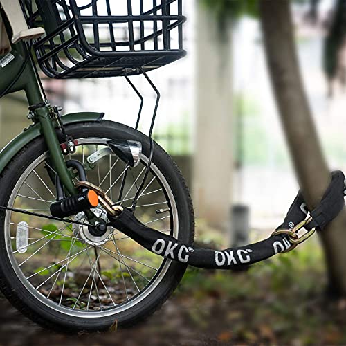
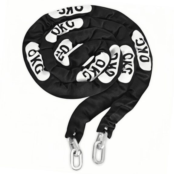
- CINCH LOOP CIRCLE LINK for effective lock-ups design extends the chain actual usage length and which means less bulk to carry.
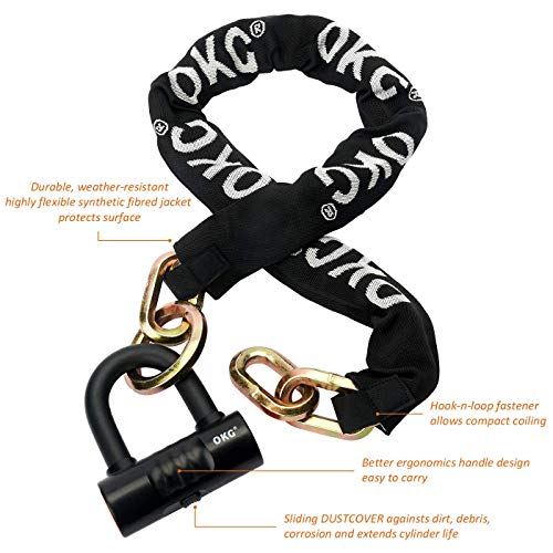
- Durable. weather-resistant. highly flexible embroidered sleeve with hook-n-loop fastener allows compact coiling and protects bike. motorbike surface. SLIDING DUST-COVER design to protect from dirt. debris. corrosion and extends cylinder life.
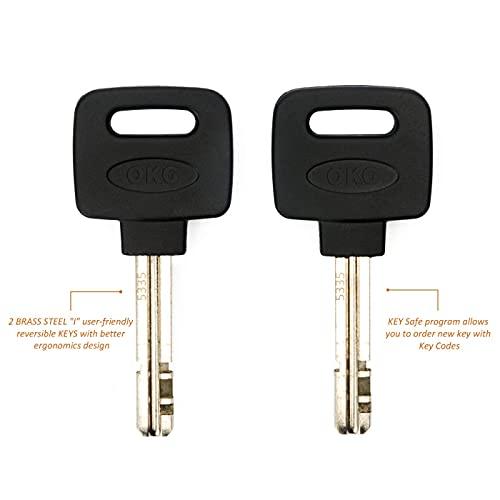
- Better ergonomics designed handle and 4 BRASS STEEL I user-friendly reversible KEYs with key code numbers; Please DO NOT HESITATE to contact us if you require further information.
/* * Used when device = desktop * Configured in: configuration/brazil-config/global/brand-story.cfg */ /* Because the carousel is implemented as an ol list. any lists in the card text will have a secondary list style (letters). This will give an incorrect appearance to viewers. so we set all lists to the primary list style (numbers). */ .aplus-brand-story-card ol li { list-style: decimal; } /* Top level containers */ .aplus-module .apm-brand-story-hero { -moz-box-sizing: border-box; -webkit-box-sizing: border-box; box-sizing: border-box; width: 1464px; height: 625px; background-color: #fff; } .aplus-module .apm-brand-story-card { -moz-box-sizing: border-box; -webkit-box-sizing: border-box; box-sizing: border-box; width: 362px; height: 453px; background-color: #fff; } .apm-brand-story-hero. .apm-brand-story-card { -moz-box-sizing: border-box; -webkit-box-sizing: border-box; box-sizing: border-box; position: relative; width: 100%; height: 100%; float: none; } .aplus-module.brand-story-card-1-four-asin .apm-brand-story-card { /* Only 12px to account for image cell border */ padding: 12px; } /* Full background image (Hero 1 & Card 2) */ .aplus-module .apm-brand-story-background-image { -moz-box-sizing: border-box; -webkit-box-sizing: border-box; box-sizing: border-box; overflow: hidden; position: absolute; width: 100%; height: 100%; } /* Card 1 small images */ .aplus-module .apm-brand-story-image-row { -moz-box-sizing: border-box; -webkit-box-sizing: border-box; box-sizing: border-box; height: 185px; padding: 0px; margin: auto; display: flex; } .aplus-module .apm-brand-story-image-row .apm-brand-story-image-cell { /* Use content-box to ensure image size matches editor schema */ -moz-box-sizing: content-box; -webkit-box-sizing: content-box; box-sizing: content-box; padding: 0px; margin: 0px; width: 166px; border: 1px solid #fff; } .aplus-module .apm-brand-story-image-row .apm-brand-story-image-cell .apm-brand-story-image-link { display: block; width: 100%; height: 100%; } .aplus-module .apm-brand-story-image-row .apm-brand-story-image-cell .apm-brand-story-image-link .apm-brand-story-image-img { display: block; width: 100%; height: 100%; object-fit: cover; } /* Card 3 logo image */ .aplus-module .apm-brand-story-logo-image { -moz-box-sizing: content-box; -webkit-box-sizing: content-box; box-sizing: content-box; height: 145px; margin: 0px 4px; padding: 20px; padding-bottom: 0px; } /* Text overlays */ .aplus-module .apm-brand-story-text-bottom { -moz-box-sizing: border-box; -webkit-box-sizing: border-box; box-sizing: border-box; position: absolute; bottom: 13px; left: 13px; } .aplus-module .apm-brand-story-hero .apm-brand-story-text-bottom { background-color: rgba(0.0.0.0.6); color: #fff; padding: 13px 65px 13px 13px; /* accounts for overlap of first card */ width: 437px; } .aplus-module.brand-story-card-2-media-asset .apm-brand-story-text-bottom { background-color: rgba(255.255.255.0.6); color: #000; padding: 13px; width: 336px; } .aplus-module.brand-story-card-1-four-asin .apm-brand-story-text { margin-top: 8px; } .aplus-module.brand-story-card-1-four-asin .apm-brand-story-text.apm-brand-story-text-single { margin-top: 20px; } .aplus-module.brand-story-card-1-four-asin .apm-brand-story-text h3 { white-space: nowrap; overflow: hidden; text-overflow: ellipsis; } .aplus-module .apm-brand-story-slogan-text { -moz-box-sizing: content-box; -webkit-box-sizing: content-box; box-sizing: content-box; margin: 0px 4px; padding: 20px; } .aplus-module .apm-brand-story-faq { -moz-box-sizing: content-box; -webkit-box-sizing: content-box; box-sizing: content-box; padding-top: 10px; } .aplus-module .apm-brand-story-faq-block { margin: 0px 10px; padding: 10px; }
.aplus-v2 .apm-brand-story-carousel-container { position: relative; } .aplus-v2 .apm-brand-story-carousel-hero-container. .aplus-v2 .apm-brand-story-carousel-hero-container > div { position: absolute; width: 100%; }
/* Ensuring the carousel takes only the space it needs. The sizes need to be set again on the absolutely positioned elements so they can take up space. */ .aplus-v2 .apm-brand-story-carousel-container. .aplus-v2 .apm-brand-story-carousel-hero-container { height: 625px; width: 100%; max-width: 1464px; margin-left: auto; margin-right: auto; overflow: hidden; } .aplus-v2 .apm-brand-story-carousel-hero-container. .aplus-v2 .apm-brand-story-carousel-hero-container > div { height: 625px; }
.aplus-v2 .apm-brand-story-carousel.a-carousel-container { padding: 0px; } /* This centers the carousel vertically on top of the hero image container and after the logo area (125px). Margin-top = (heroHeight – cardHeight – logoAreaHeight) / 2 + logoAreaHeight */ .aplus-v2 .apm-brand-story-carousel .a-carousel-row-inner { margin-top: 149px; } /* Cards need to have a width set. otherwise they default to 50px or so. All cards must have the same width. The carousel will resize itself so all cards take the width of the largest card. The left margin is for leaving a space between each card. */ .aplus-v2 .apm-brand-story-carousel .a-carousel-card { width: 362px; margin-left: 30px !important; } /* styling the navigation buttons so they are taller. flush with the sides. and have a clean white background */ .aplus-v2 .apm-brand-story-carousel .a-carousel-col.a-carousel-left. .aplus-v2 .apm-brand-story-carousel .a-carousel-col.a-carousel-right { padding: 0px; } .aplus-v2 .apm-brand-story-carousel .a-carousel-col.a-carousel-left .a-button-image. .aplus-v2 .apm-brand-story-carousel .a-carousel-col.a-carousel-right .a-button-image { border: none; margin: 0px; } .aplus-v2 .apm-brand-story-carousel .a-carousel-col.a-carousel-left .a-button-image .a-button-inner. .aplus-v2 .apm-brand-story-carousel .a-carousel-col.a-carousel-right .a-button-image .a-button-inner { background: #fff; padding: 20px 6px; } .aplus-v2 .apm-brand-story-carousel .a-carousel-col.a-carousel-left .a-button-image .a-button-inner { border-radius: 0px 4px 4px 0px; } .aplus-v2 .apm-brand-story-carousel .a-carousel-col.a-carousel-right .a-button-image .a-button-inner { border-radius: 4px 0px 0px 4px; }

Reviews
There are no reviews yet.